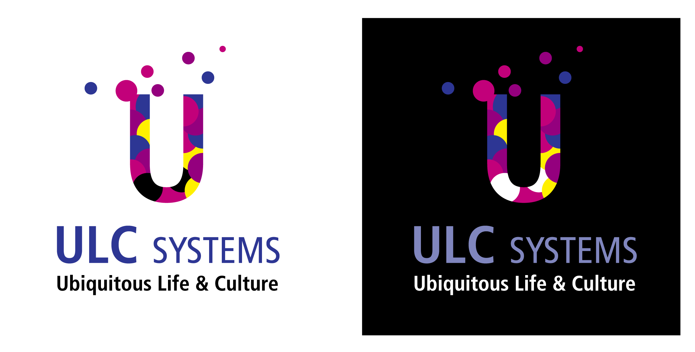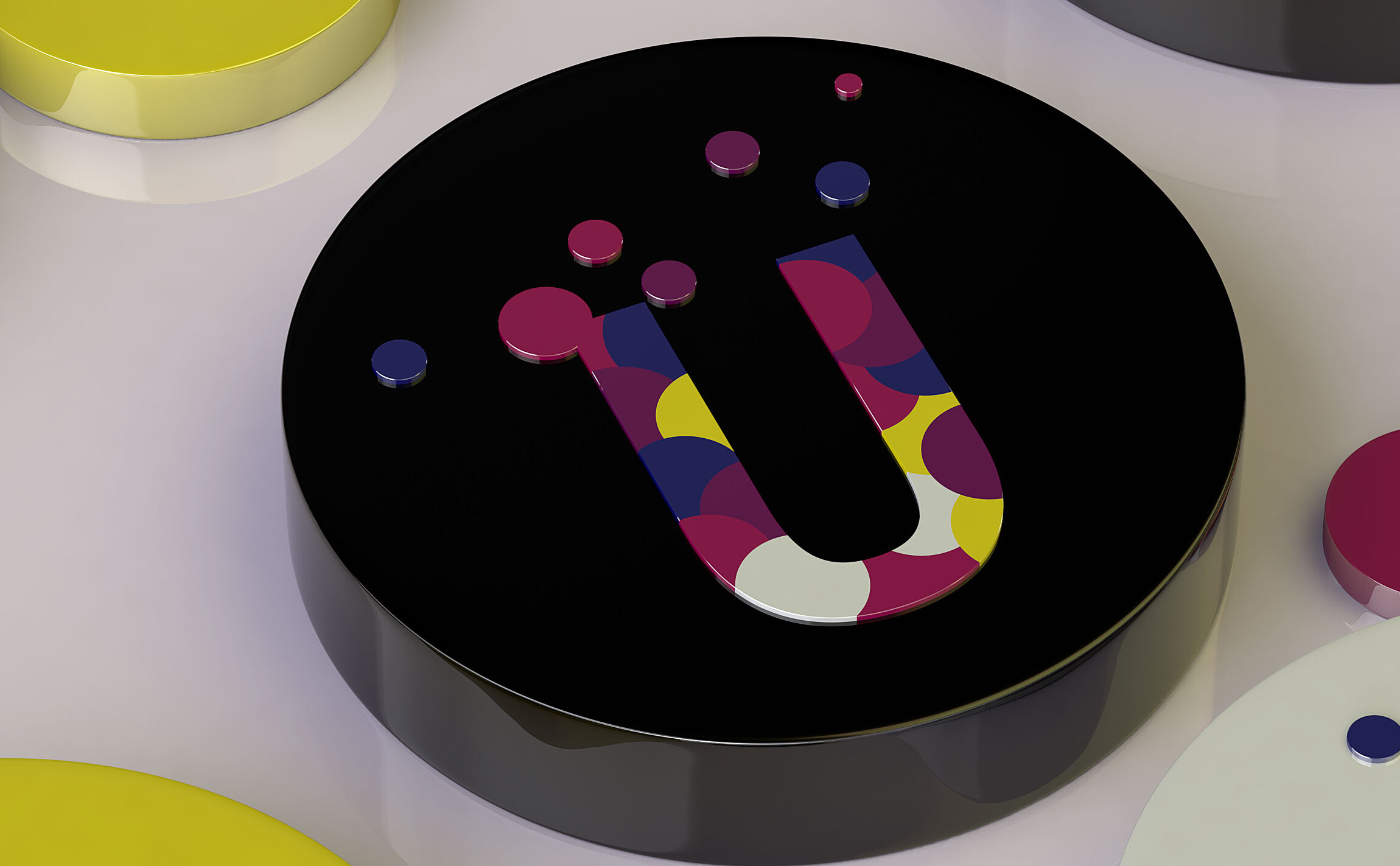
Identity design for an IT company supplies ubiquitous technology
- Client
- ULC Systems
- Design Scope
- CI, Logo
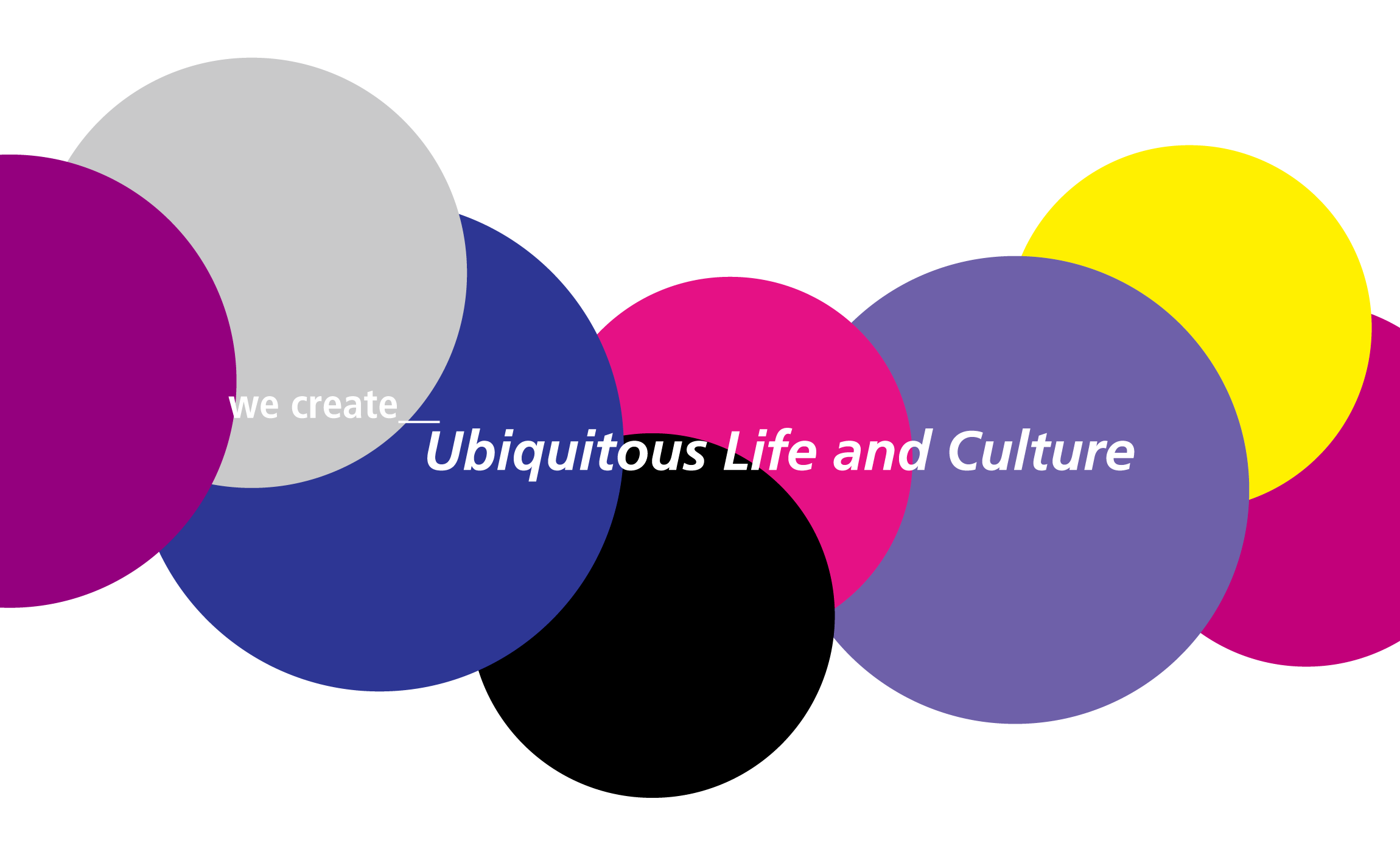
The first letter of the word ‘Ubiquitous’, U, as the foundation, this design visualizes the spreading of various information infrastructure services into the atmosphere, just as particles in the air would. Each of these miniature circular particles represents a service or a product that ULC Systems which provides ubiquitous environment infrastructure. Although a number of different colors were used, with violet as the main theme, colors that express the excitement, aspiration and dream of future days to come, rather than the cold bluish colors of technology, were implemented. Using essentially symmetric round shapes, which have a sense of wholeness, we were able to prevent the image from becoming too busy. This allows the corporate image to be seen as rather amicable while the ascending like shape conveys a more forward-looking and future-orientated image.