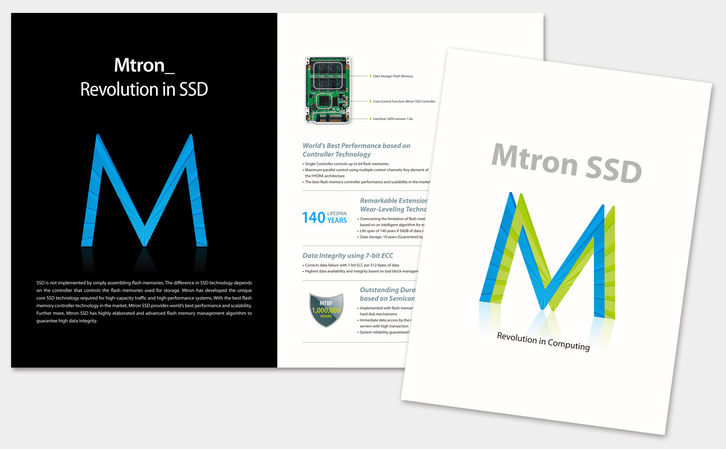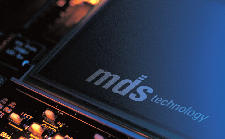
Branding and Packaging of Mtron SSD
- Client
- Mtron
- Design Scope
- Logo, Design Application , Key Visual, Package
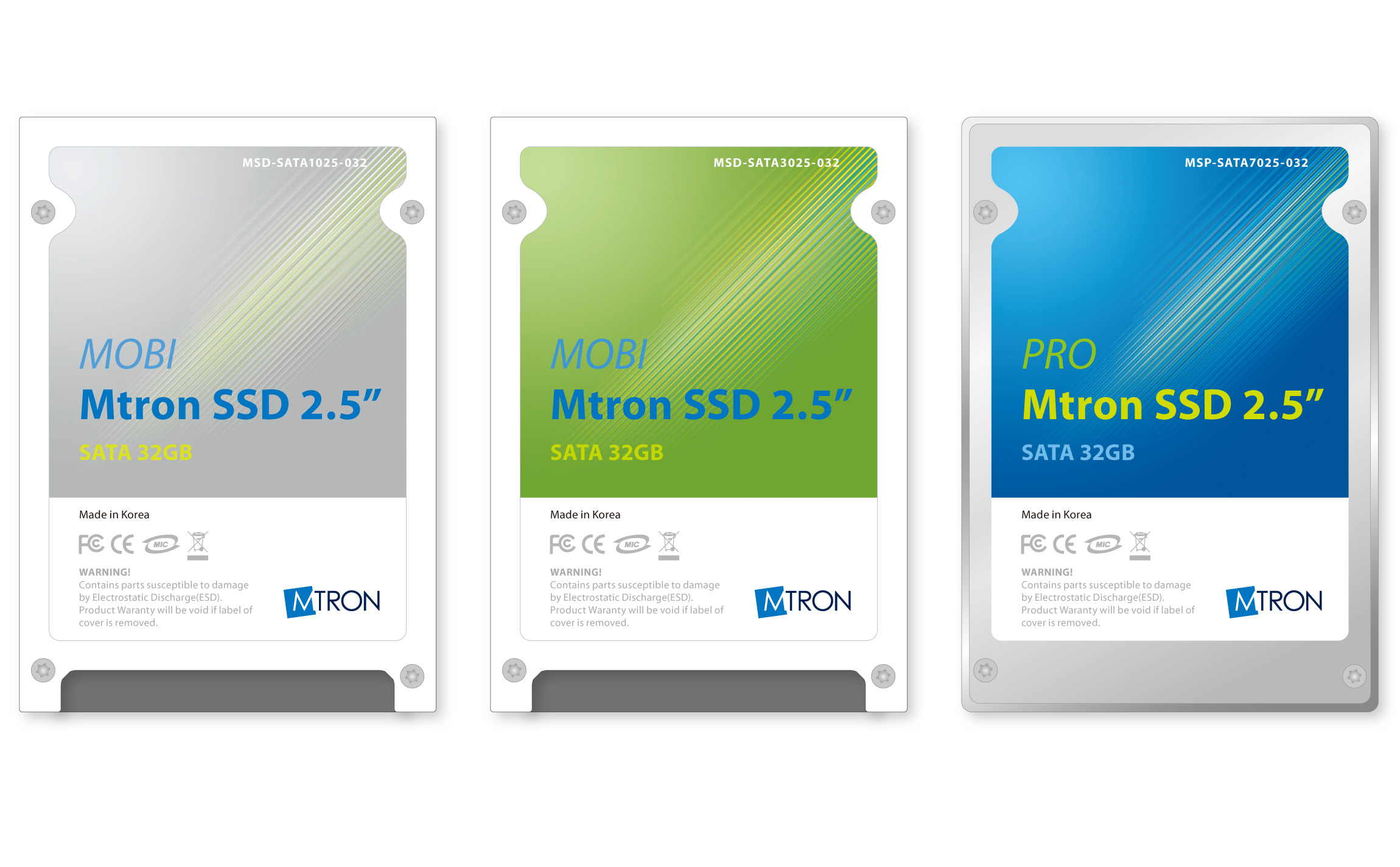
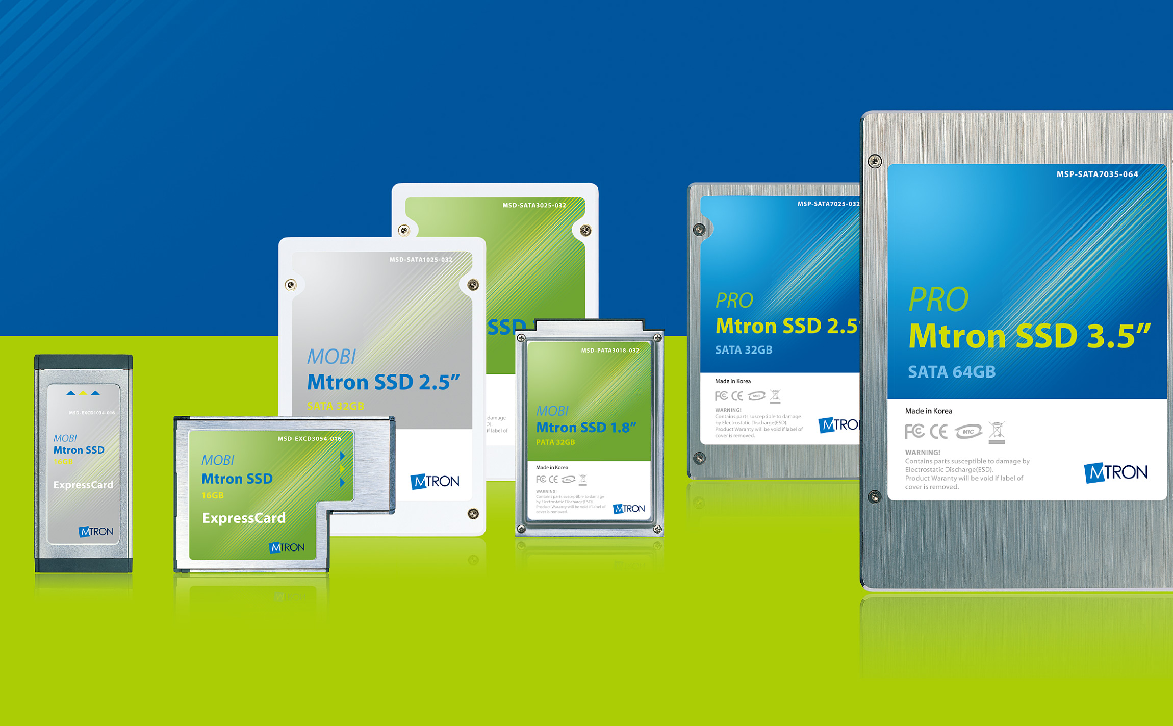
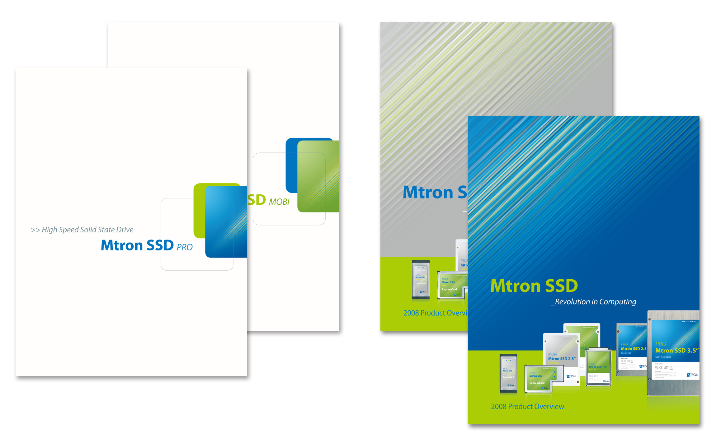
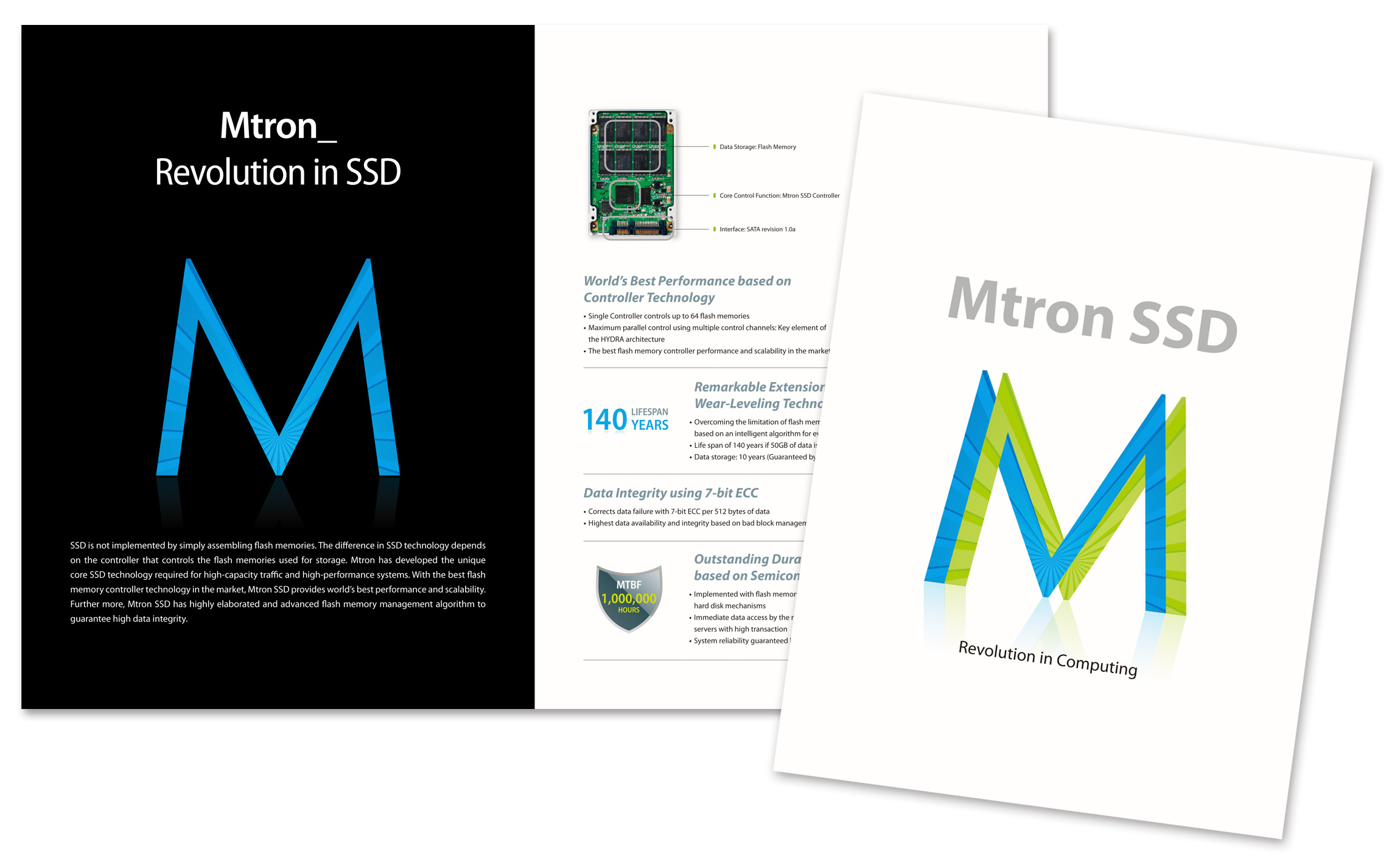
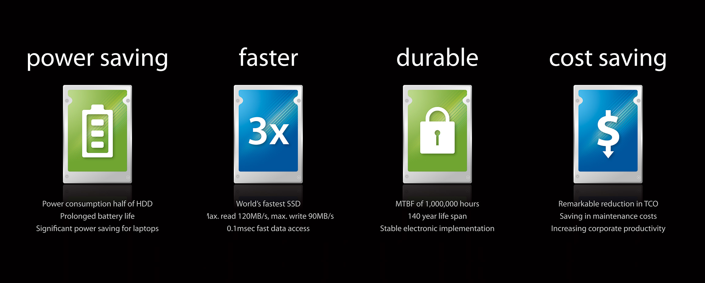
When we were first approached this design, the client lacked any kind of visual image that embedded the concept of identity besides the basic CI (Corporate Identity). Also, we were not specifically asked for the prior creation of brand identity, we had to consider the creation of these labels as the starting point for the contriving of this identity. We developed a graphic motif that can represent the product characteristics, such as high-speed, excellent durability, and applied dissimilar color to each product line-up. Since this graphic motif was first developed not solely for the purpose of labels but as well as usage in other visual images in mind, it was very easily adapted to numerous other applications, creating unique and consistent identity for Mtron product ranges. Each individual product’s has detailed information, such as form factor and type of interface etc., are noted with the use of variable boldness and hierarchy in typography to aid with its easy recognition, while careful consideration is given for its supple use in future release of new product line-ups.