Nutrition Drug Pharmagen Branding and Packaging
- Client
- Pharmatech
- Design Scope
- Logo, Brand Story, Package
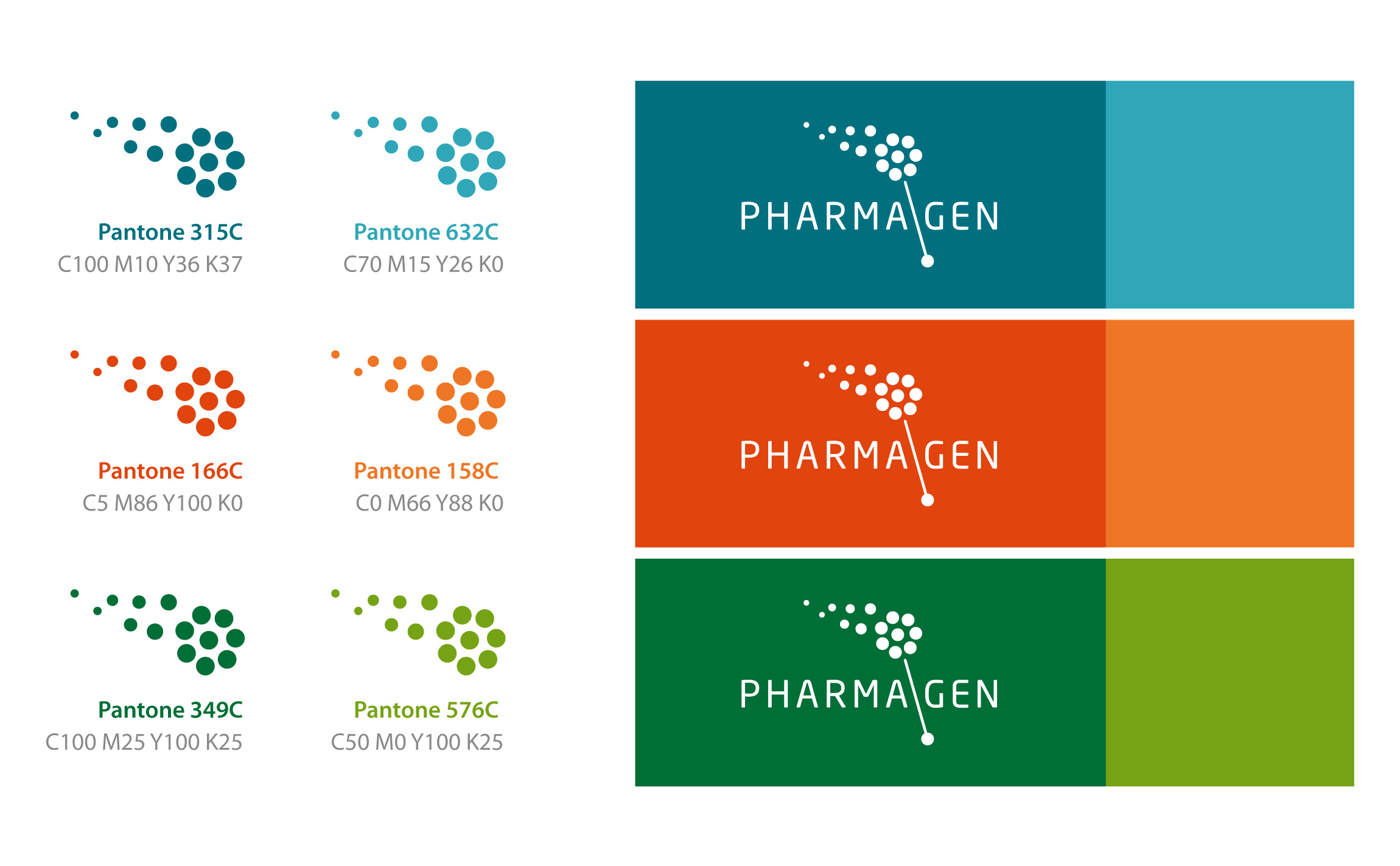
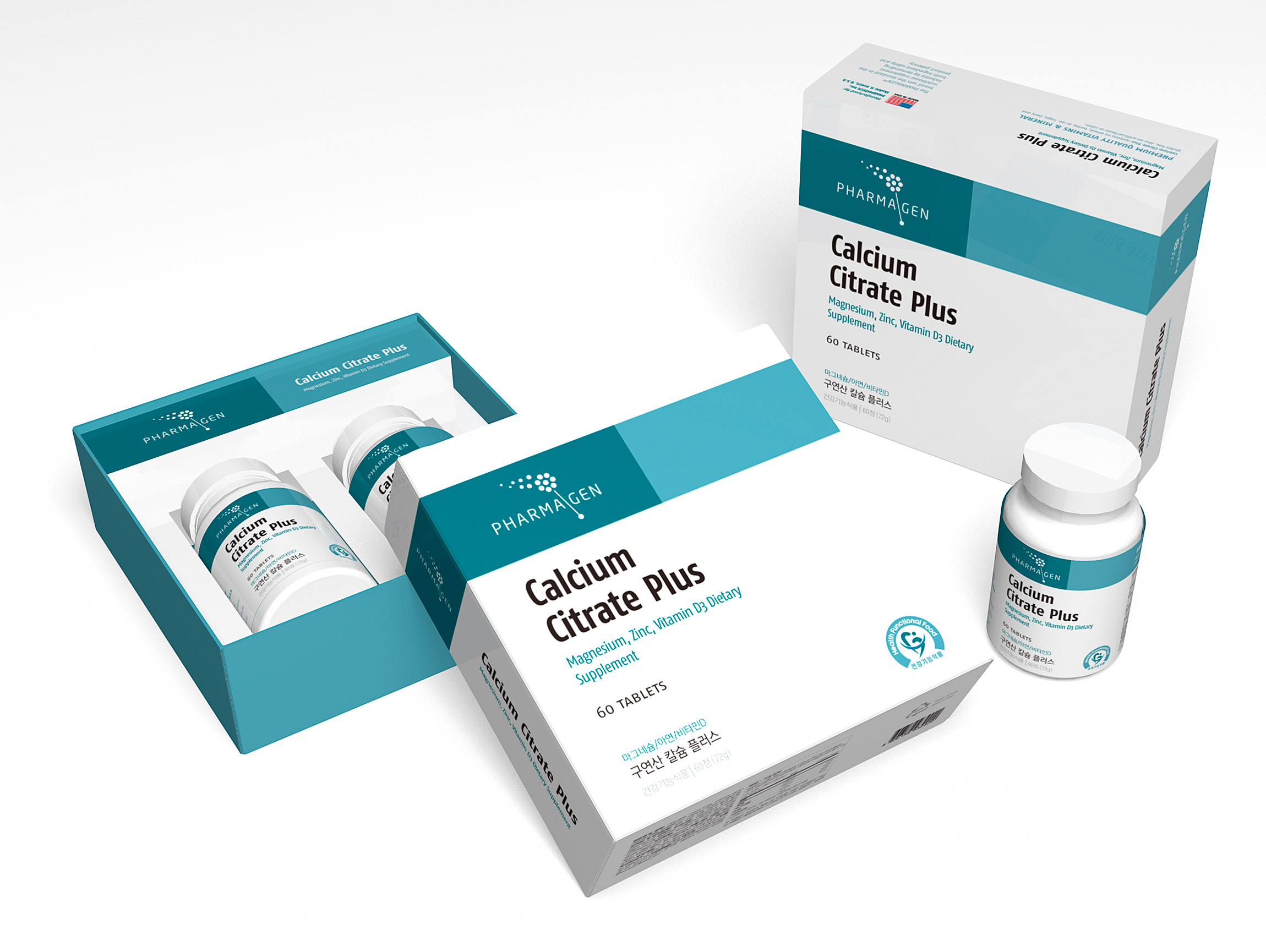
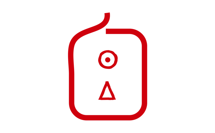
The symbol for this brand was created to show the customers that by taking this pills being healthy is as easy as a breeze, it also visualizes a magical wand. The pills purpose is to be taken every day as a Vitamin but also for medical conditions. There are lots of Nutrition Drug brands that uses leaf or environment as their brand Identity. To give Pharamagen its own unique symbol we have designed a symbol that was far from being environmental, pharmagen is a brand that is imported from the United States. This symbol is an "flower shaped magic wand". The mark can be easily remembered and be thought of.