CI system for KGBC
- Client
- KGBC
- Design Scope
- CI, Logo, Application
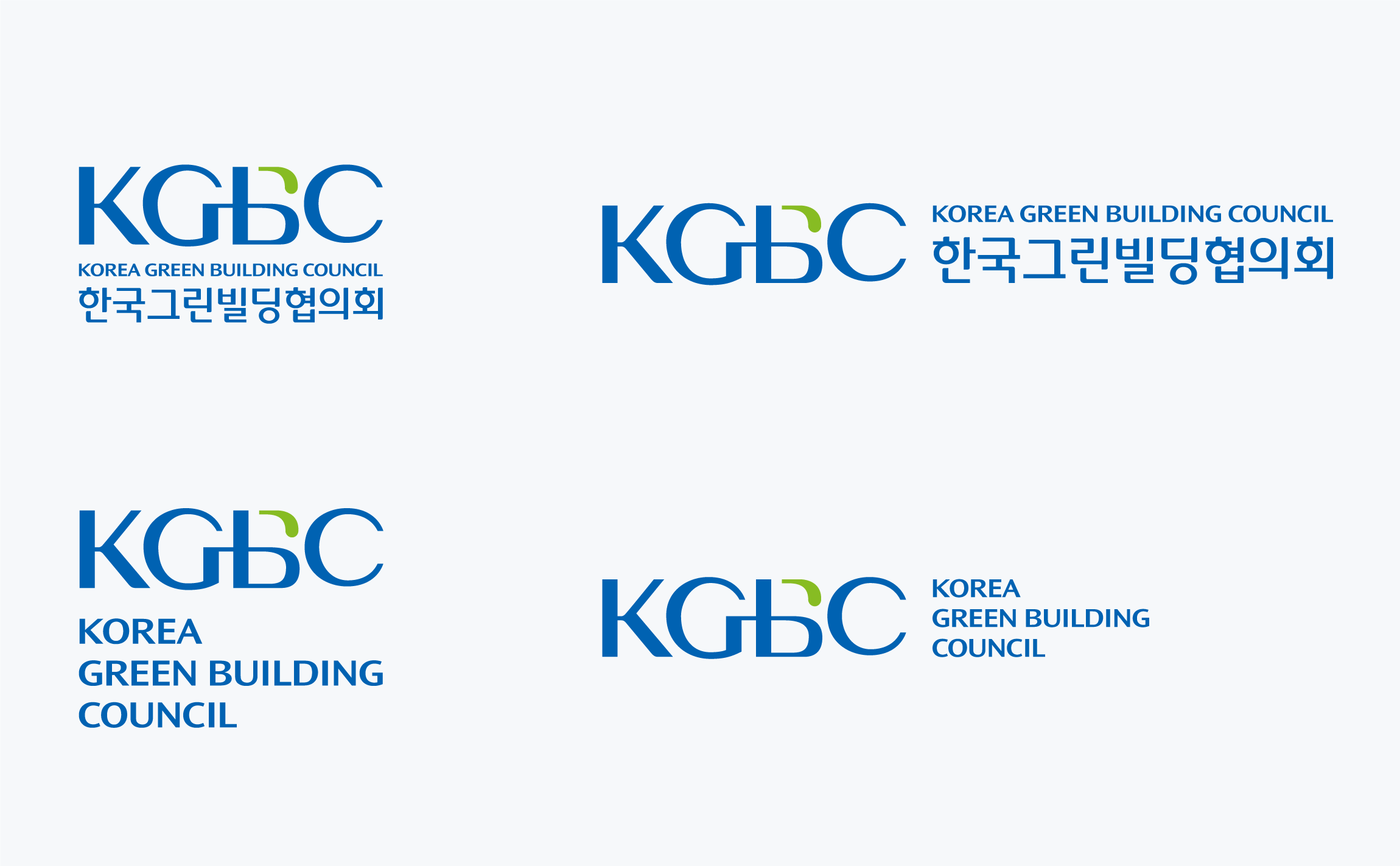
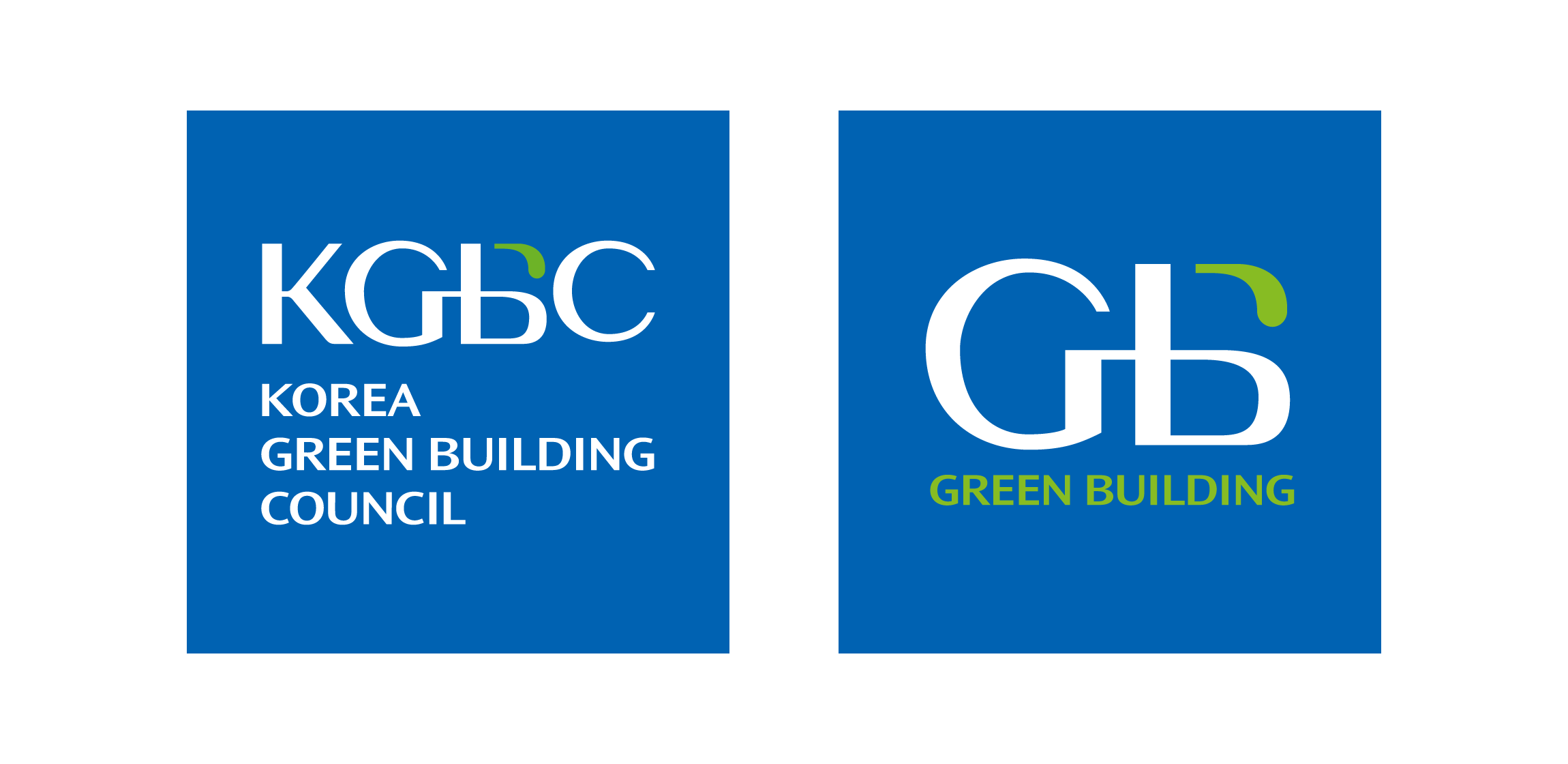
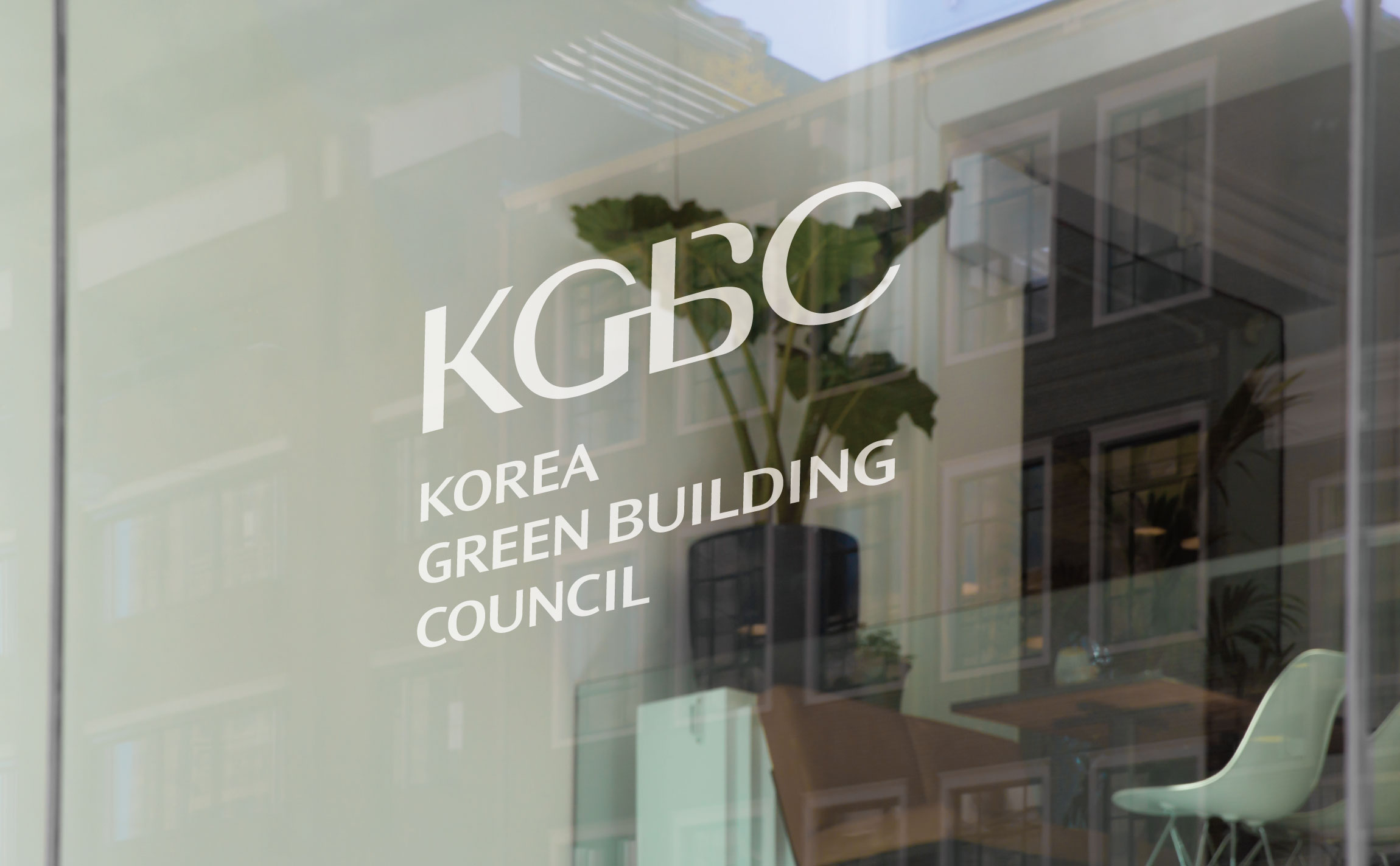
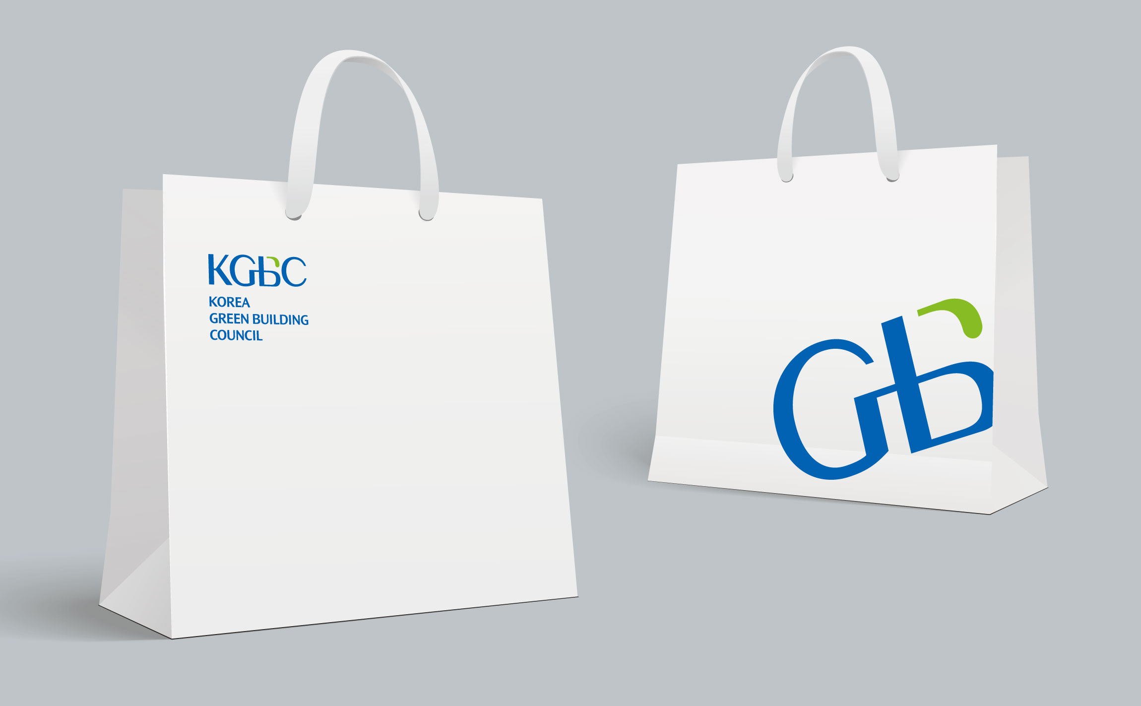
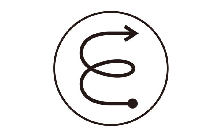
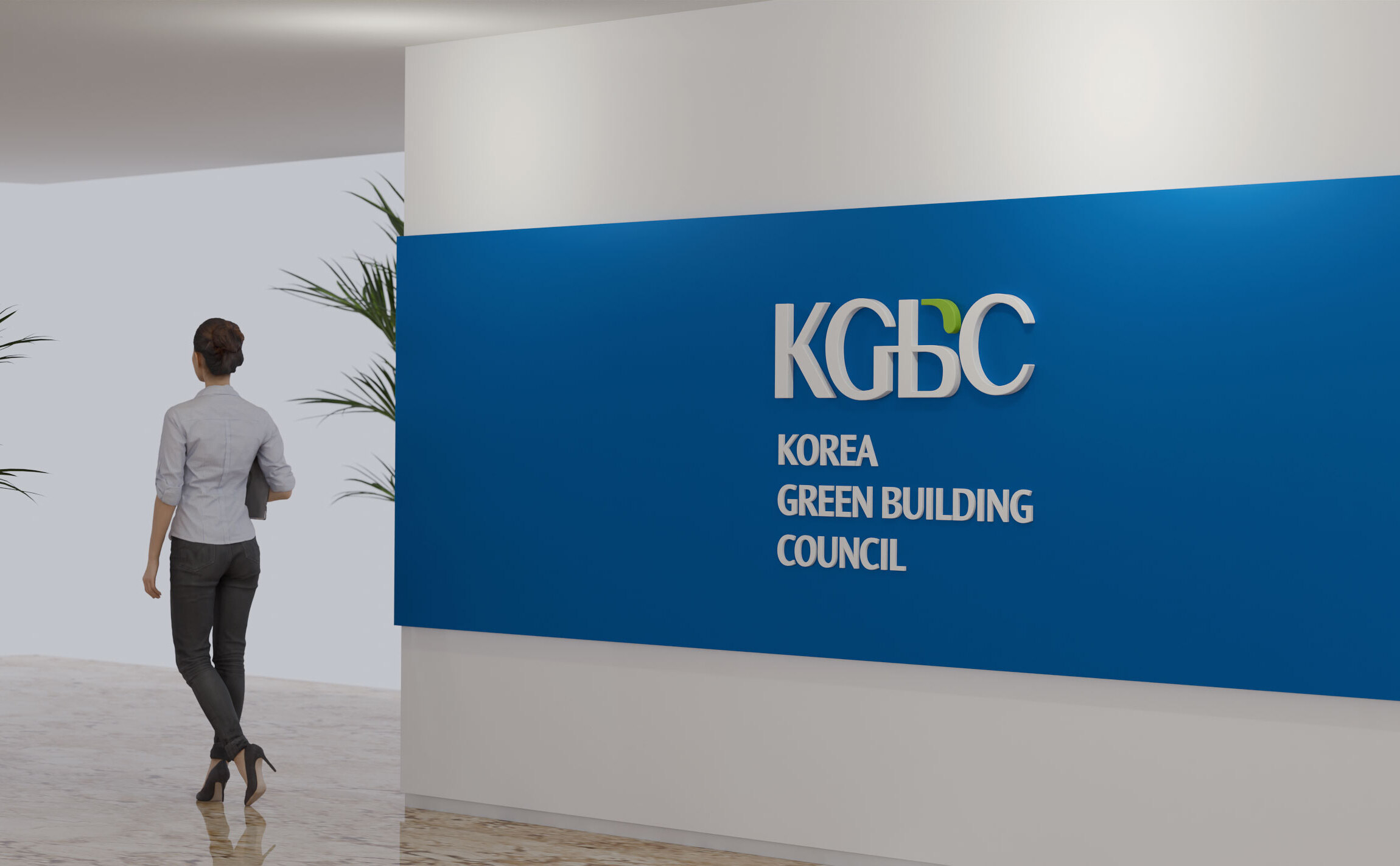
The letter mark using the English initials of the Korea Green Building Council symbolizes the ‘fusion of green and buildings’, that is, the healthy life of humanity and a clean environment made possible by the fusion of nature and technology.
The initials G and B, whose shapes are connected to each other, express the natural connection between 'green' and 'building', and 'nature' and 'technology', and the green strokes from the letter B represent the 'healthy human race' made possible by green buildings. It expresses ‘life and a clean environment’.
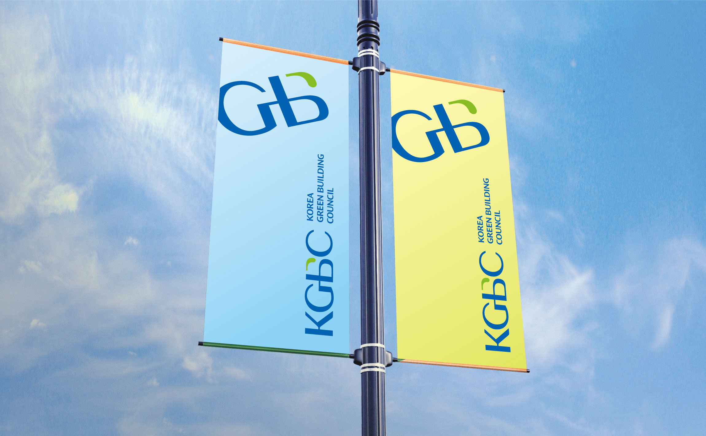
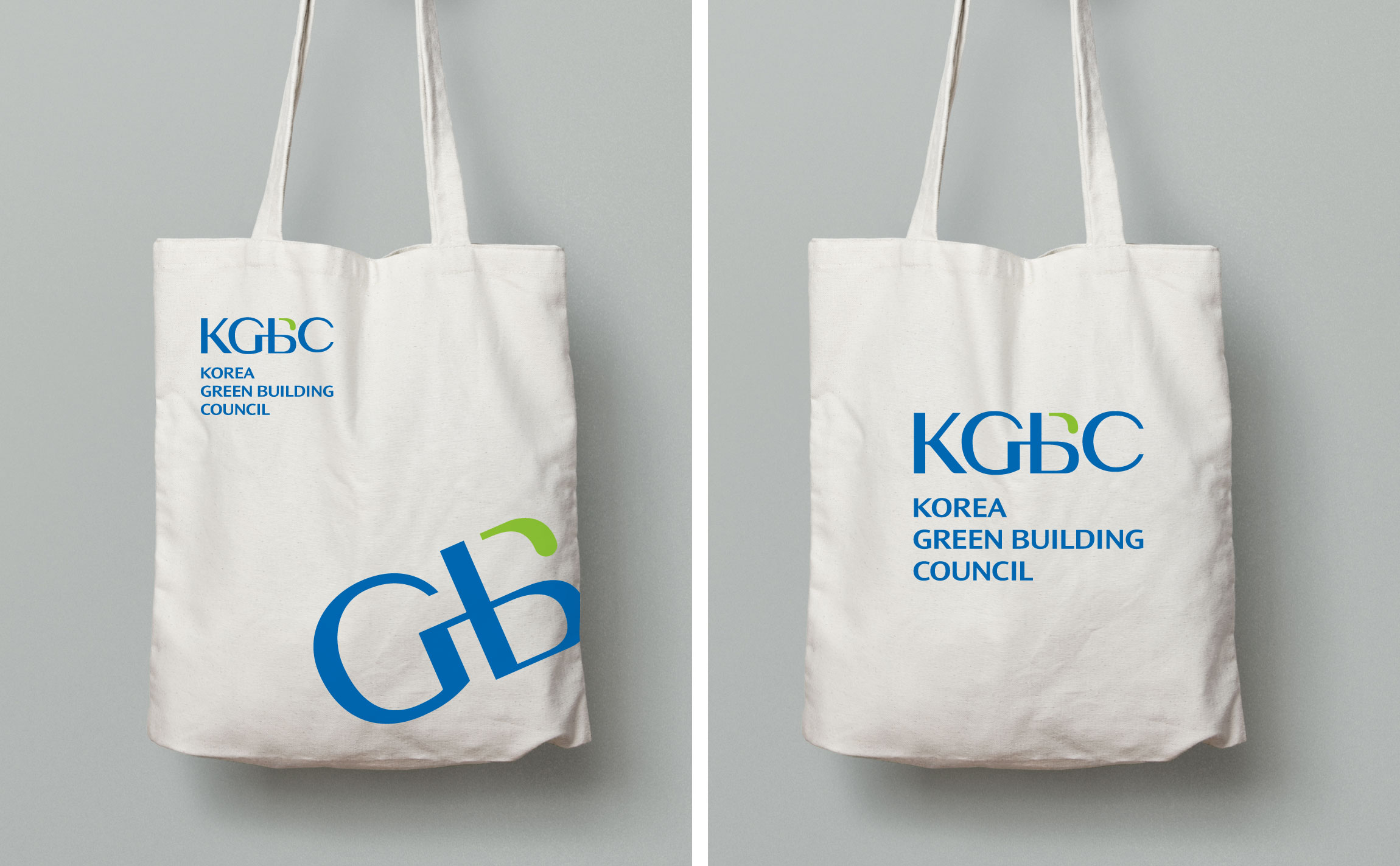
Although it's identity is based on the letter mark, the initials 'GB' were designed to be used as a symbol, allowing for a varied and sophisticated look depending on the application.
The signature was developed with not only the domestic business of the Korea Green Building Council, but also the relationship with World GBC and with global cooperation in mind, and was designed to look young and sophisticated while revealing the trustworthiness and authority of a quasi-public institution.