Identification for a New and Renewable Energy Mark
- Client
- Competition Work
- Design Scope
- Mark
An identification for a New and Renewable Energy Mark. It has been an award winning identification.
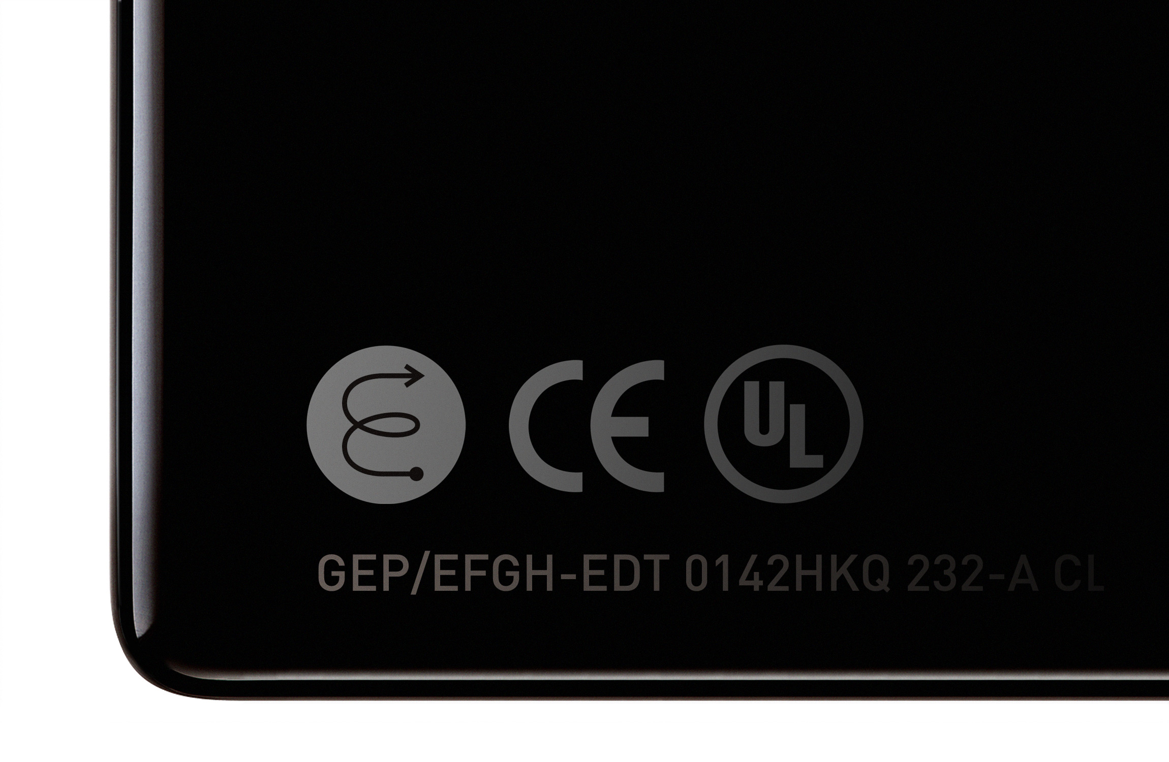
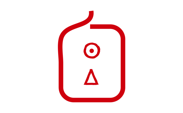
The E in the symbol has been taken out from the word Energy. The E has been made to show the flow of the energy. To show the way of energy flowing the arrow has been added. To emphasis the E the circle line has been added. The symbol also can remind viewers of a light bulb. This mark can be used not only in Korea but as well as many other countries. The design looks simple itself but has a sophisticated look at the same time. (Minimal and modern as well.) This mark is a very practical design, with its simple but "going straight to the point" look it has grabbed many attention, and left a strong image. Since it was designed as a monogram it is easier to be used on many different types of applications.
The E in the symbol has been taken out from the word Energy. The E has been made to show the flow of the energy. To show the way of energy flowing the arrow has been added. To emphasis the E the circle line has been added. The symbol also can remind viewers of a light bulb. This mark can be used not only in Korea but as well as many other countries. The design looks simple itself but has a sophisticated look at the same time. (Minimal and modern as well.) This mark is a very practical design, with its simple but "going straight to the point" look it has grabbed many attention, and left a strong image. Since it was designed as a monogram it is easier to be used on many different types of applications.